See your profit or loss in bright color
To make it easier to see trends in your business profit or loss, as well as what’s driving it, we are excited to add a new chart to the top of your Profit and Loss report, above the traditional table:
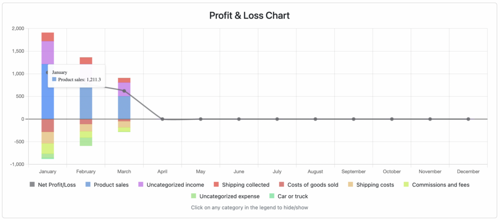
Mouse over any color on the chart to see the amount for that category, for that period.
One fun feature – if you click a category name in the legend, it will toggle that category on and off, so you can choose to isolate certain categories.