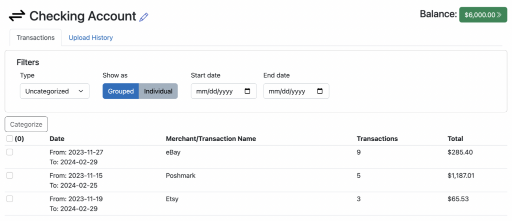
See more of the important information on your screen
We’ve made several changes over the past few weeks to make it easier to see the most important information on your Seller Ledger screen.
Account balance details
When clicking into an account view from your Dashboard, we had previously shown the balance details at the top (including totals funds, available funds, etc.) by default. However, because customers tend not to rely on these details every time they click into the account, we have moved them under a new “Balance” button:

Click the green “Balance” button to see the balance detail information:

Click on the same button to hide these details. This reduces valuable vertical screen real estate and fits more transactions on the screen.
Rapidly categorizing transactions
Again, in an effort to make better use of vertical screen real estate, we’ve also changed the interaction for bulk editing of uncategorized transactions, pleasing everything on the same row:

Changing category of individual transactions
In an effort to make each transaction row more readable, and to save space, we have combined the visual cue for changing a transaction category with the category name, especially for uncategorized transactions:

Please let us know what you think of these changes by contacting us at [email protected]
